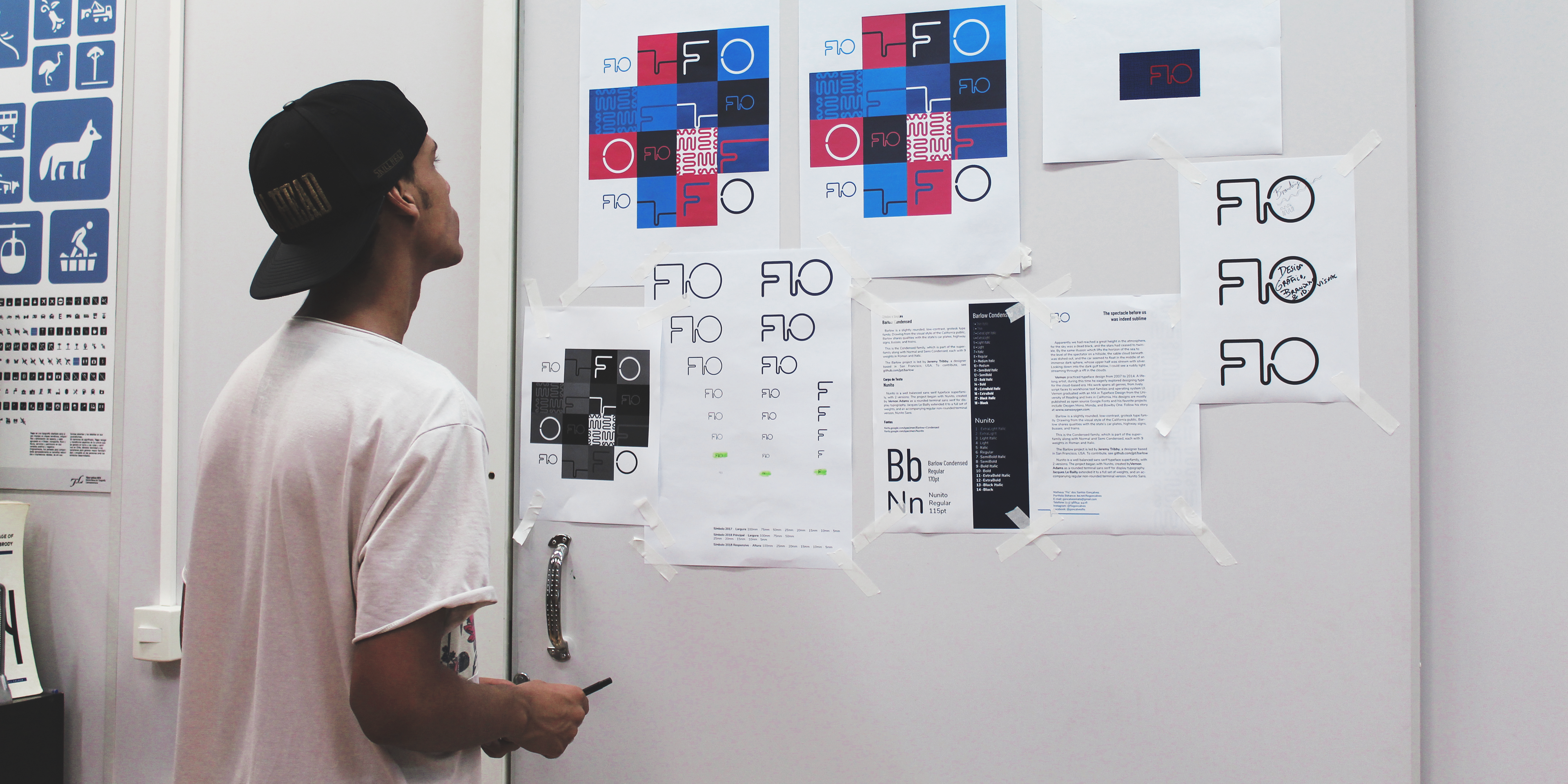
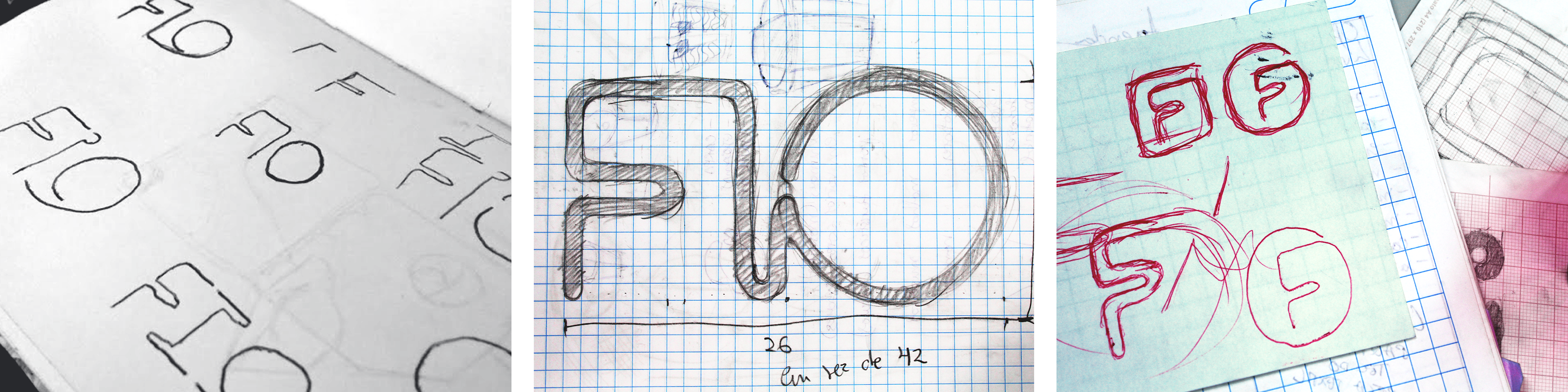
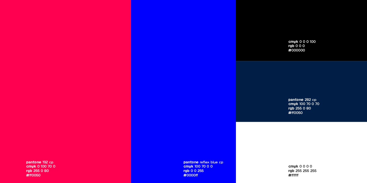
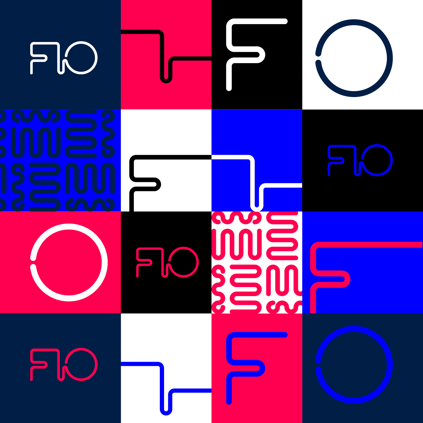
Se meu nome é Fio, então o logo tem que ser formado por um unico fio, mas como desenhar isso sem parecer FLO ou FTO? Liguei a letra I e a letra O pelo centro para haver a leitura correta de imagem e texto de FIO.
If my name is Fio (which means wire, but it’s pronounced as few) my symbol get to be drawn in just one line but how to do it and it doesn't look like FLO or FTO? I linked I and O letters by their centers to have the right reading of text and image of FIO.


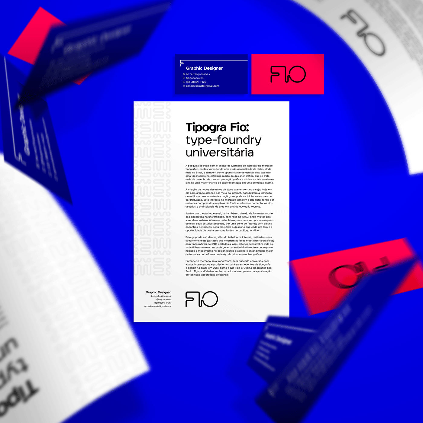


Mockups
iPhones. MockupWorld, Ui8
MacBooks: MockupWorld, Denis Plushenko
MacBooks: MockupWorld, Denis Plushenko
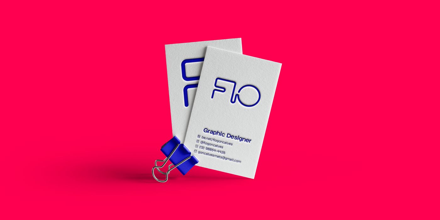
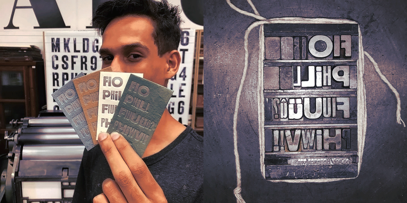
Letterpress Card: Alexandre Cardoso
Letterhead: Alexandre Cardoso
Letterhead: Alexandre Cardoso