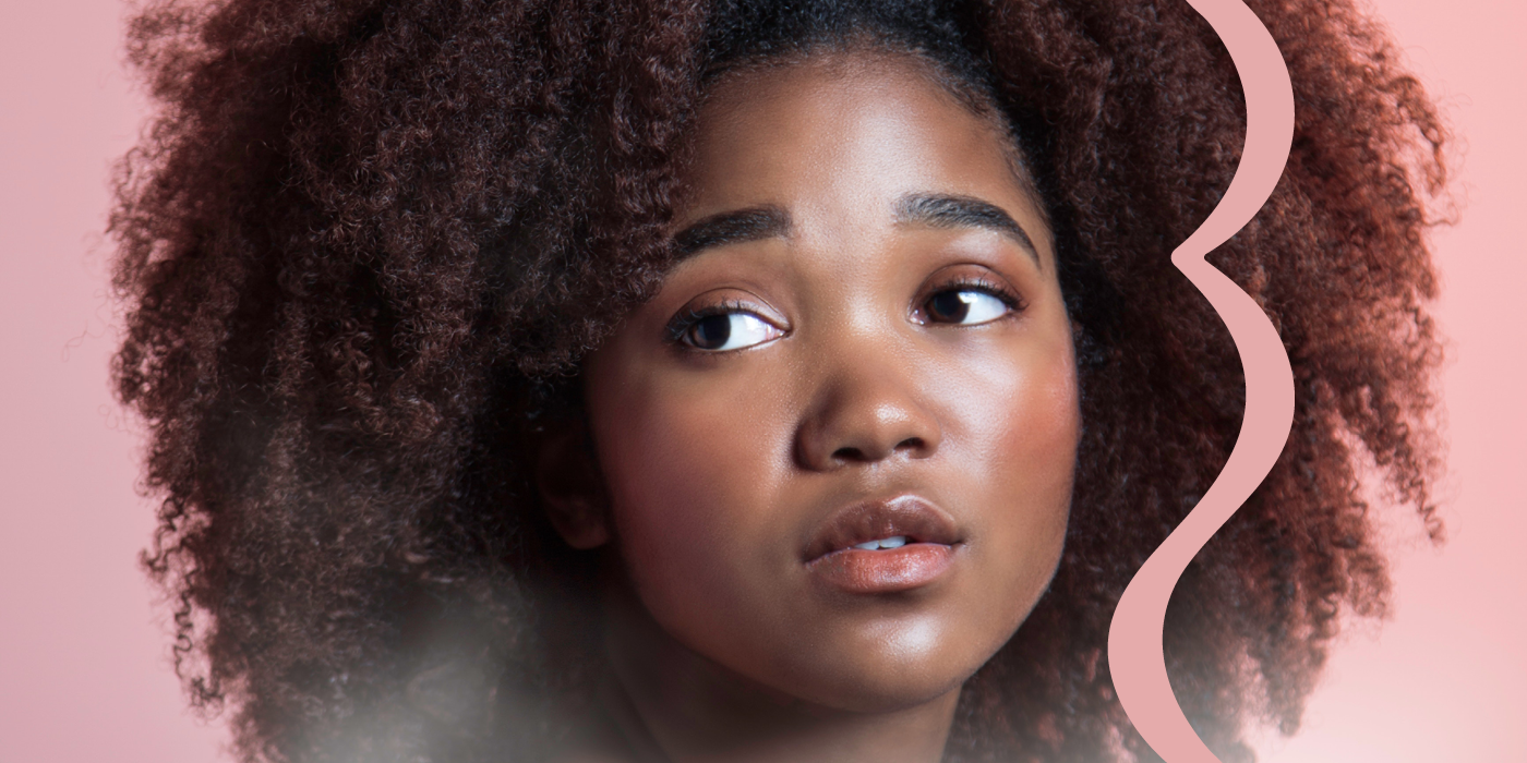
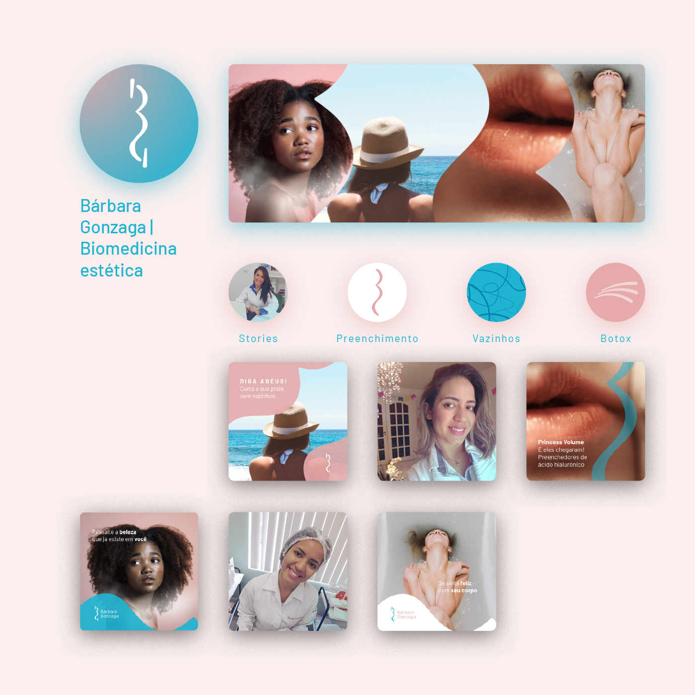
PT: Bárbara é uma biomédica esteta com seu consultório situado em Guarujá/SP. Trabalha na área da saúde estética desde 2015 e teve sua marca estabelecida no ano citado, têm sua marca estabelecida desde 2015, com o logotipo feito por mim mesmo; nesta época eu não estava na faculdade de design e fiz a marca com os conhecimentos que tinha até então. Quatro anos depois, Bárbara sentiu a necessidade de ter publicações em suas mídias sociais que chamassem mais a atenção de seu público alvo, mulheres que querem realizar pequenos procedimentos estéticos e se sentirem melhor com suas aparências, também demonstrou precisar de postagens mais claras, objetivas e informativas. A partir dessas motivações, percebi que seria uma boa oportunidade de renovar sua identidade visual e entregar um melhor suporte para sua redes e materiais.
EN: Bárbara is a biomedical esthete with her clinic based in Guarujá/SP - Brazil. She works on this field since 2015 with her own brand designed by myself; back then I wasn’t at design school and crafted the logo with the knowledges I had by the time. Four years later, Bárbara felt the need of having her web posts calling more her target attention, women who wants to have minor procedures in order to feel better with their appearance, also she showed herself needing clearer, more objective and informative posts. That’s when I realized it would be a good opportunity to renew her visual identity and delivery a better support for her media and material.
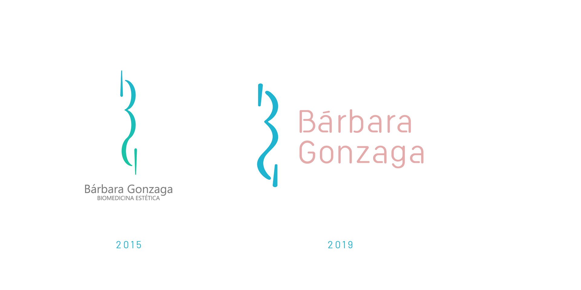
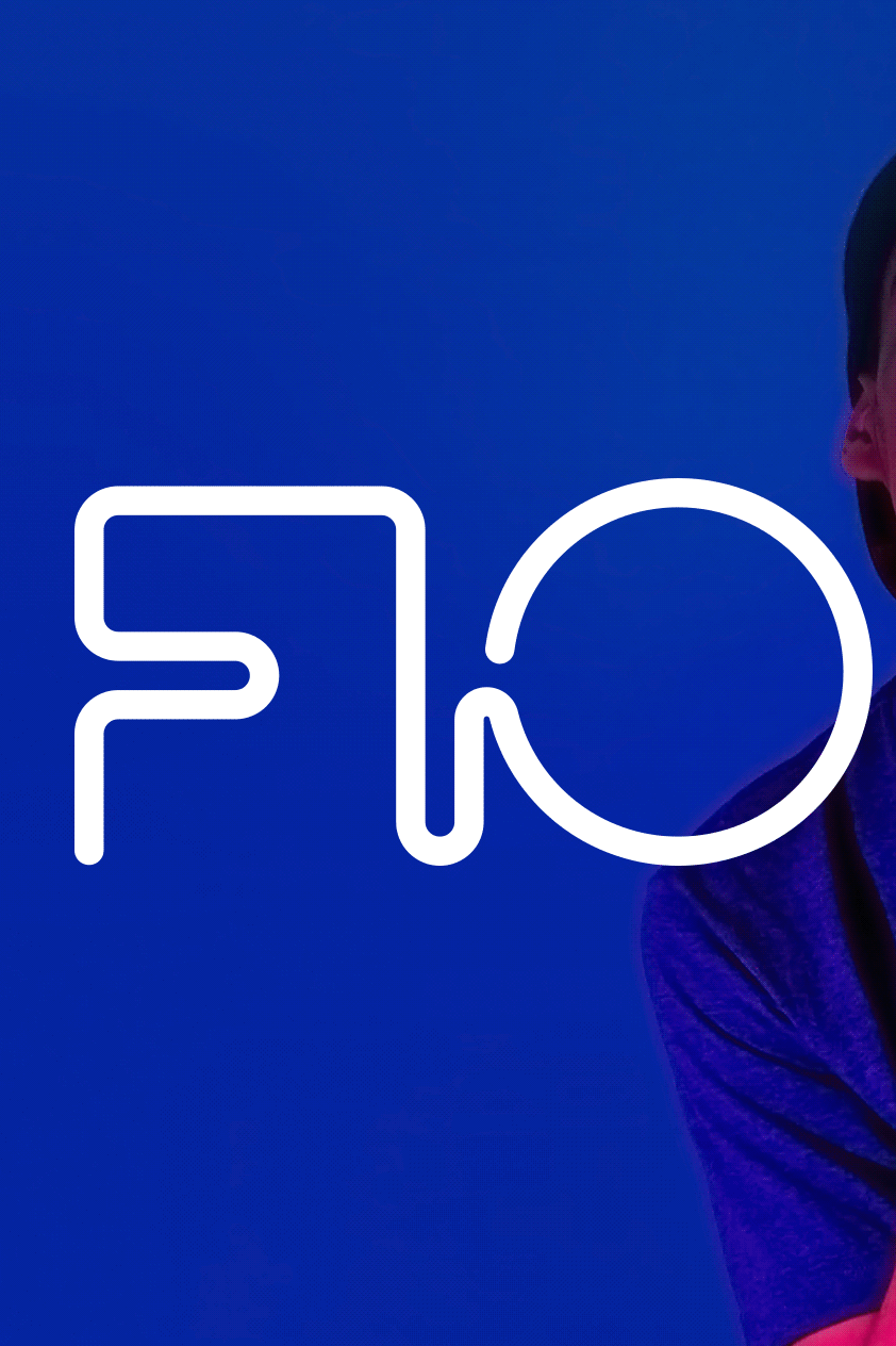
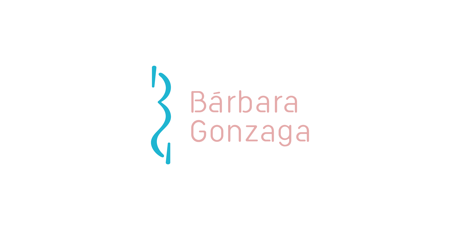
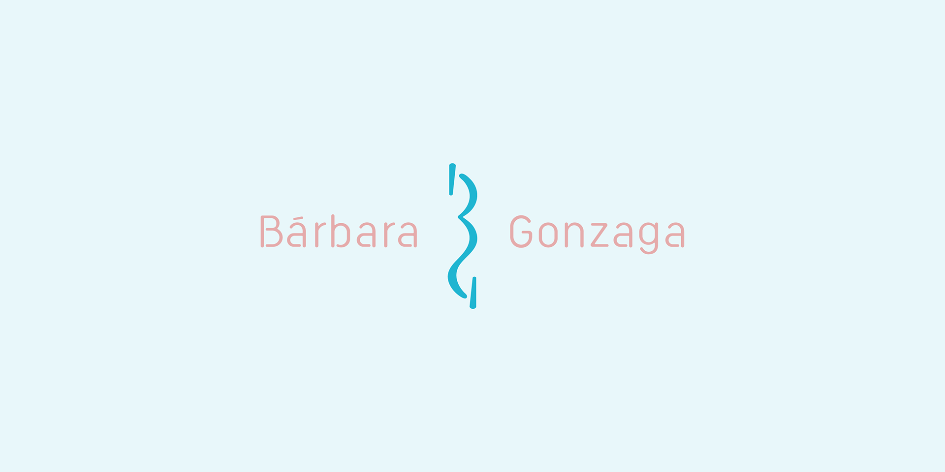
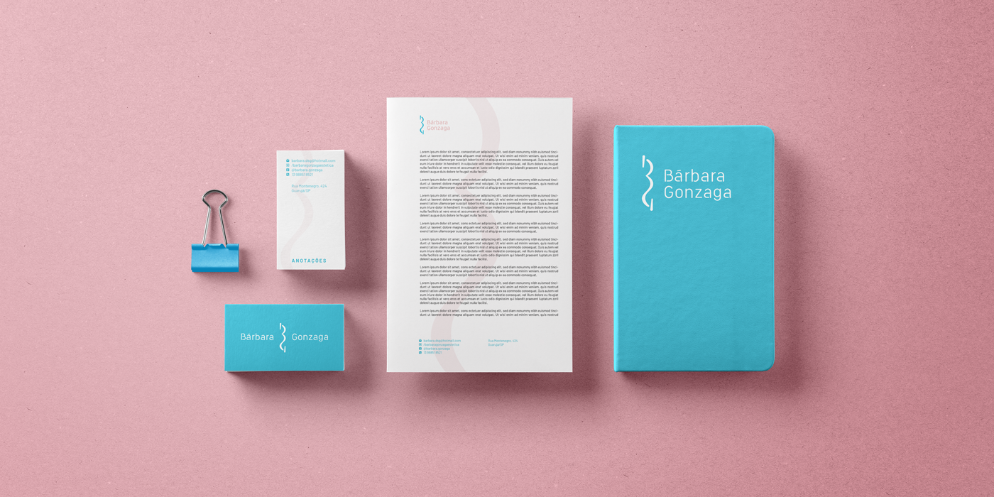
PT: O símbolo, a junção das letras B e G, inspiradas em curvas do corpo feminino, tem, agora, um um traçado mais fluido e mais robusto, que garante uma melhor redução e visualização da marca, seu equilíbrio visual está melhor trabalhado e funciona em melhor harmonia com o logotipo em suas assinaturas visuais.
EN: Symbol, the junction of the letters B and G, inspired by the woman body, has, now, a more fluid and bolder stroke, therefore there is better reduction and view of the brand, its visual balance is better designed and works in a better harmony with the logotype in the visual signatures.
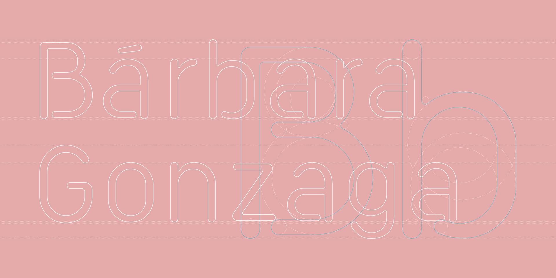
PT: Todas as letras do logotipo foram cuidadosamente desenhadas para que conversassem mais com o símbolo e dessem mais personalidade para a marca. As curvas são suaves e não há cantos vivos, o que é planejado para uma leveza em grandes formatos e melhor redução em telas ou impressões, em pequenos.
EN: All the logotype letters were carefully designed for talk more to the symbol and give more personality to the brand. The curves are soft and there aren’t hard corners, what is thought to bring lightness in great views and better print or screen reduction, in smaller ones.
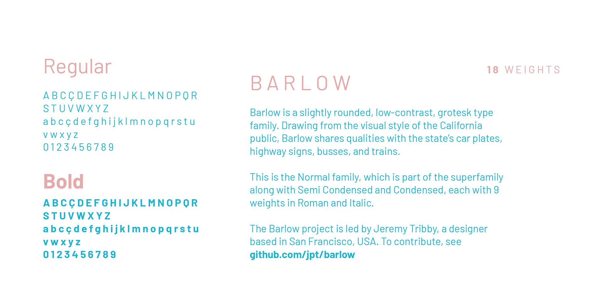
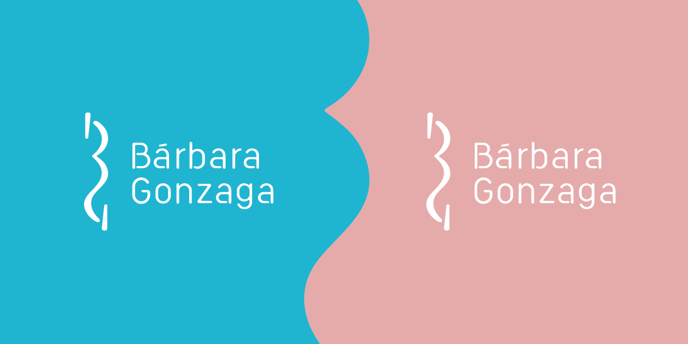
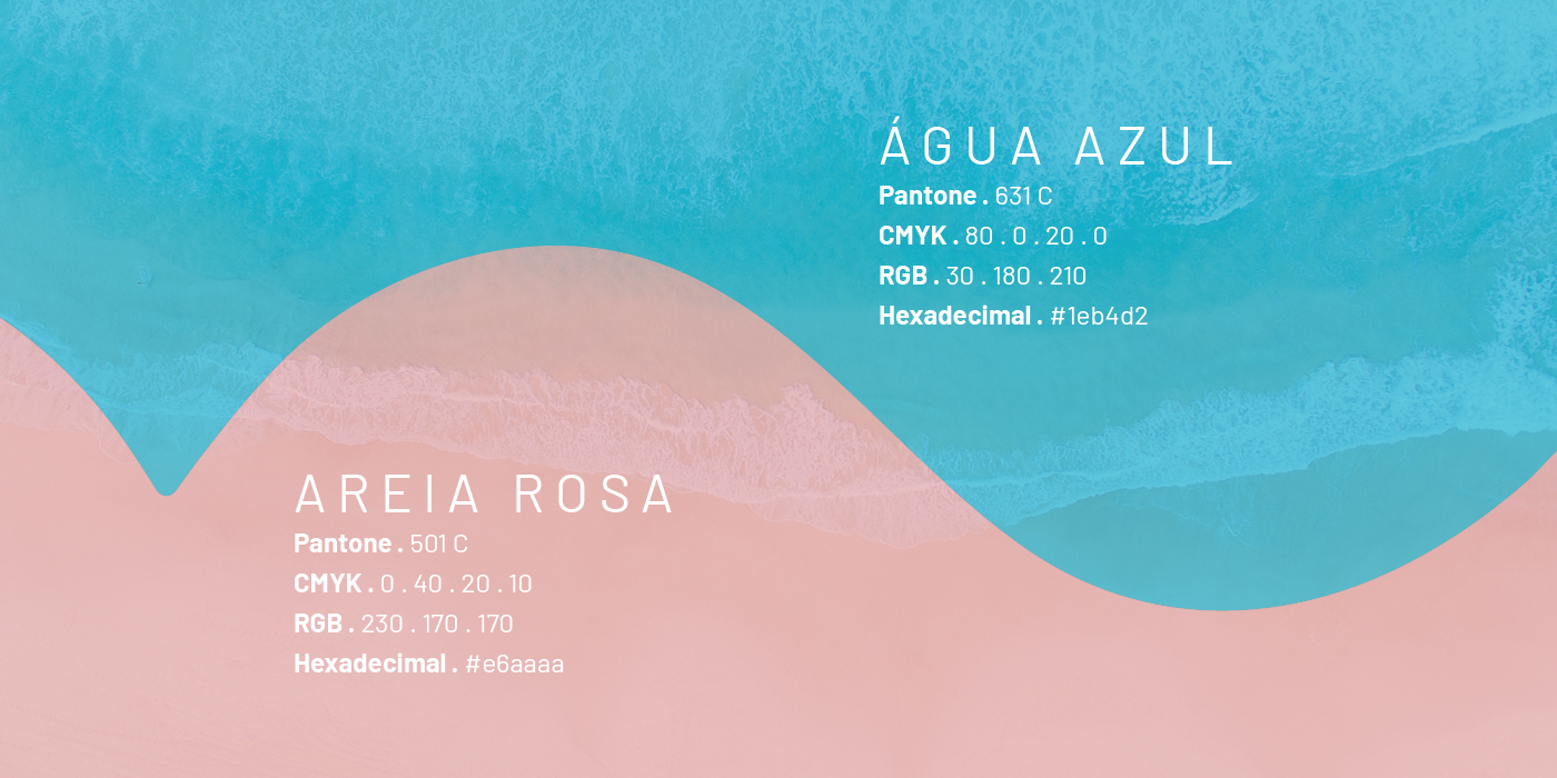
PT: Barlow entra na identidade com a função de manter todo o ritmo do logotipo, das cores e da identidade como um todo, desde o light até o bold, com cantos arredondados e informativos para monitores ou tinta no papel. As cores são uma referência aos elementos da cidade de Guarujá, como a areia e água do mar, em um leve contraste em frio e quente.
EN: Barlow takes place on keeping the rhythm of the logotype, colors and the identity, from the light to the bold, having rounded corners and clear in information for a computer monitor or ink on the paper. The colors are a reference to some Guarujá city elements, like sand and water, in a light contrast of cold and hot.
Luca Devitadze
Anna Sastre
Rodolfo Sanches Carvalho
Jens Kreuter
Jessica Felicio
Fezbot2000
Stationary mockup:
MockupWorld and Pixeden